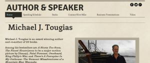
It’s been SOOOO long since I’ve posted, but not for a lack of topics! I’ve actually started creating websites for new authors — really fun stuff when you’ve got about two year’s creativity bottled up inside because you took a job with a boring company (but I digress).
Oftentimes new authors are so amazed to see a website that’s been created for them — it has their own smiling face looking back at them, for Goodness sakes — that they’re speechless. They’re happy, they feel empowered … then they want to smear that lovely website with all sorts of information and text, making it instantly unreadable.
But that’s just my experience.
So I decided to investigate what successful authors’ websites look like and consider the design elements that may be employed on my client’s behalf. At the least, I hope to illustrate to my clients what the websites of successful authors look like, and my investigation has revealed great variety. And great simplicity.
Gillian Flynn is a relative newcomer, with just a handful of books published, so her site doesn’t try to bowl the reader over with images of book covers, instead it creates a mood centering on her most recent work. Note how other book titles are discreetly in the nav bar above, keeping the entire page uncluttered.
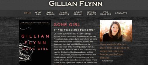
And I love the essay she’s written inside about women’s outlets for violence that makes me want to read her stuff:” …I think women like to read about murderous mothers and lost little girls because it’s our only mainstream outlet to even begin discussing female violence on a personal level. Female violence is a specific brand of ferocity. It’s invasive … Some of the most disturbing, sick relationships I’ve witnessed are between long-time friends, and especially mothers and daughters. Innuendo, backspin, false encouragement, punishing withdrawal, sexual jealousy, garden-variety jealousy — watching women go to work on each other is a horrific bit of pageantry that can stretch on for years.”
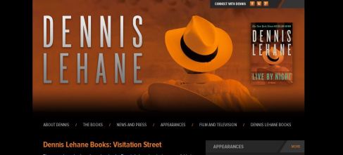
Many major authors focus their websites on their most recent work, like Dennis Lehane whose home page is a simple image of his most recent book cover. It’s interesting, because you have to interact with the site (click on a link or scroll) to get any info. (And it’s out of date, hello??)
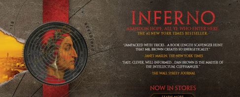
Dan Brown‘s site goes on and on and on — yet in a unified, cryptic design that’s perfect for his genre. Below are two screenshots, the first being your initial view of his site, the second (info about Brown) comes into view when you scroll down. It’s also quite lovely and dark…

Two sites I really enjoyed were for authors James Patterson and Neil Gaiman, and when I look at them I think “do these guys ever sleep??” because the sites are reflections of their wildly prolific personalities. Patterson has movie reviews on his site alongside DOZENS of book covers. And he has been working on a platform to get kids more involved in reading to boot.
Gaiman is playing the piano on his site, which made me take note of the use of embedded video, a growing trend (yet hopefully more stable than it used to be) … oooh, I better get back to work on my client’s stuff, this really raises the bar.


This has been a fun little side trip — it’s helpful to get your nose out of your own stuff sometimes and look around for inspiration.